


Quick answer: People judge your brand’s trustworthiness in seconds, mostly from visual cues: your logo, your colors, your layout, your photography. This is not shallow. It is how human perception works. Having worked with brands from global names to local shops, here is what visual hierarchy actually does, and how to use it to earn trust instead of accidentally destroying it.
Semiotics sounds academic. It is the study of signs, of how meaning gets communicated through symbols, colors, and images. And here is my unpopular opinion: every small business owner is already a semiotician. They just do it badly. Every time you pick a profile picture, choose a brand color, or decide what your storefront looks like, you are sending signals. The only question is whether you are sending them on purpose.
Your visuals are talking before your words do
Before anyone reads a word of your website or caption, they have already formed an impression from the visual layer. Is this professional or amateur? Premium or cheap? Trustworthy or sketchy? These judgments happen almost instantly, and they are stubborn. Good copy cannot rescue bad visual first impressions, because most visitors never stay long enough to read the copy.
Think of it this way: your visuals are your brand’s body language. You can say all the right things, but if your body language contradicts them, people believe the body language. A brand that claims to be premium but uses blurry photos and five clashing fonts is telling the truth with its visuals and lying with its words. Guess which one the customer trusts.
The two questions every visual answers
Every visual choice your brand makes answers two questions for the viewer, whether you intend it or not. First: what kind of business is this? Price level, professionalism, personality, all decoded from visual cues in seconds. Second: can I trust these people? Consistency, care, and attention to detail, all read from the same cues.
Notice that neither question is answered by what you say. Both are answered by what you show. This is why “we are a premium brand” means nothing if the Instagram grid looks like a flea market. The visuals already gave the answer.
The hierarchy: what the eye reads first
Visual hierarchy is simply the order in which the eye travels across a design. In practice, people notice in this order: images of people, large headlines, bold colors, then body text. This is not a theory I invented. It is how human vision prioritizes information, and it holds whether the surface is a website, a social profile, or a storefront.
The practical consequence is brutal: if your most important message is buried in paragraph four while a generic stock photo dominates the top, your hierarchy is working against you. The eye goes where the eye goes. Your job is to put the important thing where the eye lands.
The five-second test
When I review a brand’s social profile or website, I run the five-second test. Glance at it for five seconds, look away, and ask: what do I remember? Whatever survived those five seconds is what your hierarchy is actually saying. Make sure it is the right thing.
Try it on your own accounts right now. Open your Instagram profile, count to five, look away. What do you remember? If the answer is “a jumble of colors” or “nothing,” your hierarchy has no hero. The fix is subtraction: one clear focal point per surface, and everything else in a supporting role.
People, then headlines, then color
Faces win the hierarchy battle because the human brain has dedicated hardware for recognizing them. A face in your hero image or pinned post will be processed before anything else on the page. Use this deliberately: the face should belong to someone connected to the brand, and it should carry the expression you want associated with the business.
After faces, size does the talking. The largest text on the page is read as the most important, which is why a giant decorative quote above your tiny value proposition is a hierarchy failure. Make the most important words the biggest words. It sounds obvious. Almost nobody does it.
Consistency is the trust signal
Here is the semiotics lesson that matters most for small businesses. Every repeated visual choice becomes part of your brand’s language: your colors, your fonts, your photo style, your tone. When those stay consistent, customers learn to recognize you instantly, and recognition feels like trust. This is not a metaphor. Familiarity genuinely reduces perceived risk.
When visual choices change randomly, the opposite happens. A brand that looks different every week feels unstable, even if the product is excellent. The customer’s unconscious reasoning is simple: if they cannot keep their own visuals straight, what else are they sloppy about?
What consistency looks like at both ends
A global consumer brand like NIVEA communicates trust through ruthless consistency: the same blue, the same clean layouts, the same calm tone, everywhere in the world. You recognize it before you read a word. That recognition took decades to build and it is worth billions, and the mechanism is the same one available to you.
A local restaurant communicates trust completely differently: through real photos of real food and real people, posted in a consistent style. Different visuals, same principle. Every element is a signal, and the signals agree with each other.
This is why I hold the same discipline on every account I work on: one font family, one color logic, one photo style. It is not about being boring. It is about being recognizable. Discipline reads as professionalism, and professionalism reads as trustworthiness.

The three-piece consistency kit
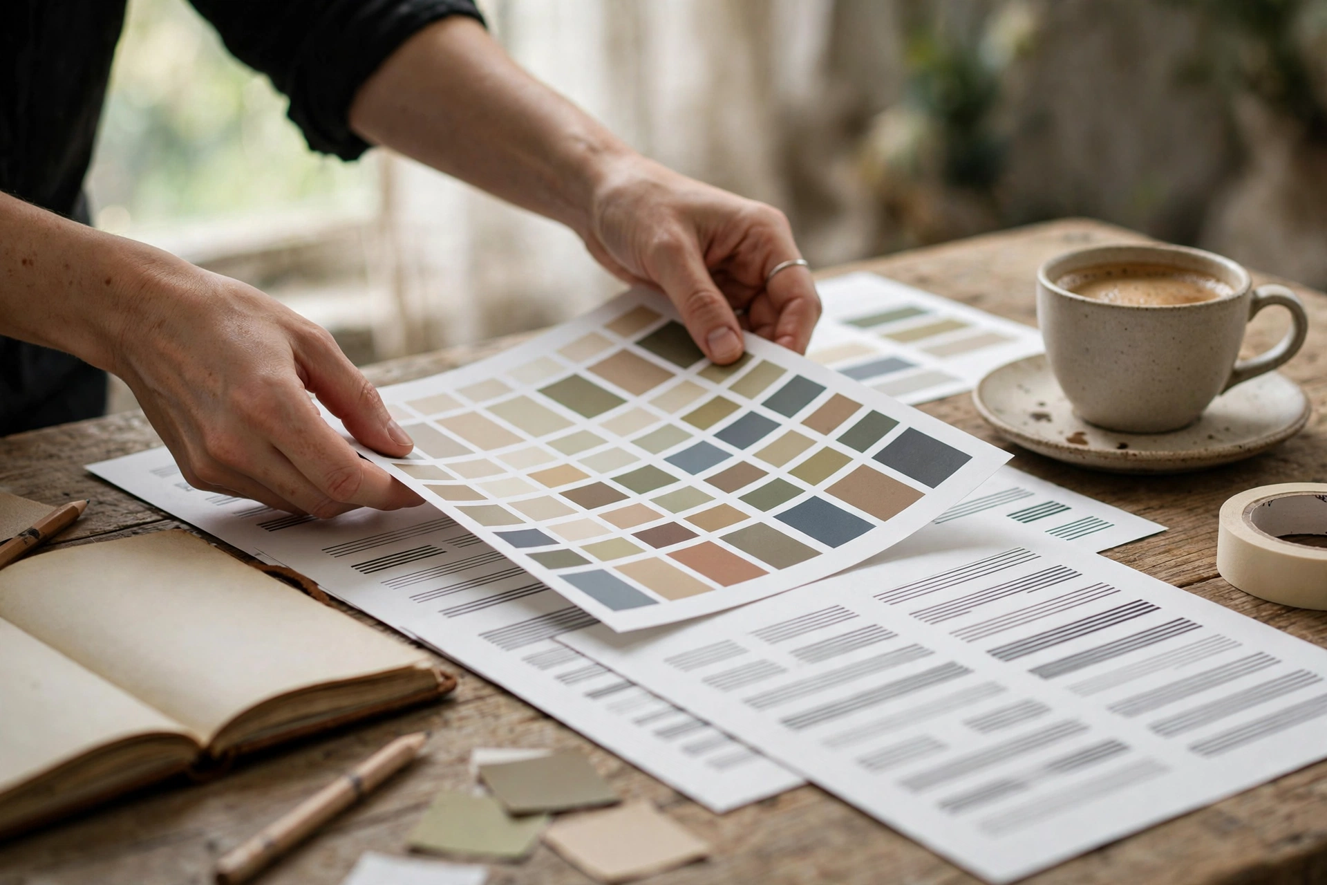
You do not need a 60-page brand book. You need three decisions, written down, followed always. One typeface for everything (this site uses a single font family site-wide for exactly this reason). One color logic: two or three colors with defined roles, primary, accent, background. One photo style: the same light, the same framing instincts, the same honesty, every time. Three decisions. That is the whole kit.
Trust signals versus trust killers
Once you start reading visuals as signals, you can audit any brand in minutes. Here is the checklist I run through, and the patterns that separate brands people trust from brands people scroll past.
| Trust signal | Trust killer | Why it matters |
|---|---|---|
| Consistent colors across every surface | A different palette every month | Consistency builds recognition; randomness signals chaos |
| Real photos of real people and places | Stock photos of strangers | Real is verifiable; stock feels like hiding |
| One clear focal point per design | Everything shouting at once | Hierarchy shows you respect the viewer’s attention |
| Readable type with breathing room | Tiny text crammed into graphics | Legibility says you have nothing to hide |
| Profile grid that looks like one brand | Nine posts, nine different styles | The grid is your storefront window |
Notice what is missing from the trust-killer column: nothing here requires money to fix. Every one of these is a decision, not a purchase. That is the good news and the bad news. The good news is that trust is cheap to build. The bad news is that there is no excuse left.
Three fixes you can make this week
One: audit your profile grid
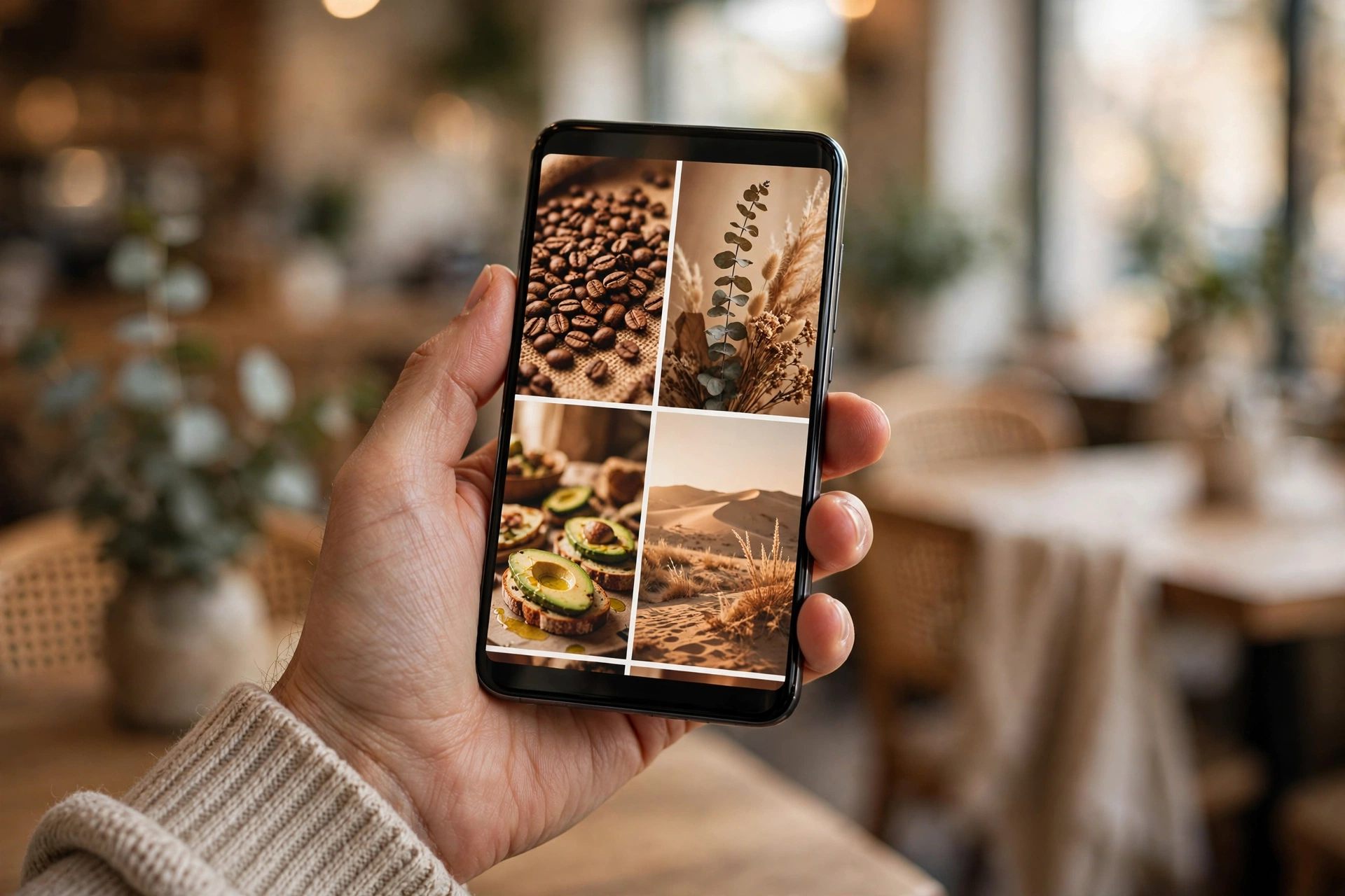
Look at your last nine posts together, as a stranger would. Do they look like they come from the same brand? If not, pick one photo style and commit to it. Delete or archive the worst offenders. Your grid is the first thing a new visitor judges, and a messy grid is a trust tax on every future post.
Two: simplify your bio and highlights
One clear line about what you do, and highlights that answer real customer questions: what you sell, where you are, how to order, what it costs. Clarity is a visual choice too. A bio that reads like a riddle tells the visitor that doing business with you will also be a riddle.
Three: fix your worst first impression
Whatever a new visitor sees first, your pinned posts, your homepage hero, your Google listing photos, make it your best, most honest visual. First impressions compound: the visitor who trusts you in five seconds reads your copy generously. The visitor who doubts you in five seconds reads it looking for the catch.
Semiotics in the wild: learn by decoding brands you admire
The fastest way to develop this skill is to practice it on other people’s brands. Pick three brands you admire, ideally in different industries, and decode them like a detective. What are their exact colors? What does their photography have in common? What is the biggest thing on their homepage, and what does that choice say about what they value?
You will notice something quickly: the brands you admire most are the most disciplined. That is not a coincidence. Admiration is usually recognition wearing a nicer suit. When you can articulate exactly what a brand is doing visually, you can steal the principle, not the look, and apply it to your own business.
What to steal and what to leave
Steal principles: the discipline of one typeface, the courage of whitespace, the consistency of a photo style. Leave aesthetics: their exact colors, their exact layouts, their exact tone. A bakery that copies a tech startup’s visual language does not look modern. It looks confused. Your visuals should signal your industry, your price point, and your personality, not someone else’s.
This is an exercise I run with clients before designing anything. We look at a handful of brands together, some they admire and a couple of competitors, and decode what each one signals. By the end, the client can usually articulate their own visual language in sentences. That articulation becomes the brief, and everything downstream gets easier.
When to break your own rules
Here is the part the brand-guideline purists will not like: consistency is the default, not the prison. There are moments when breaking the pattern is the most powerful signal you can send, because a break in a consistent pattern gets noticed.
A brand that posts in its signature style for months and then posts something raw and unfiltered for a genuine moment, a behind-the-scenes crisis, a heartfelt thank-you, earns enormous attention precisely because the break means something. But this only works if the pattern exists first. Randomness broken by randomness is just noise. Discipline broken once, deliberately, is a statement.
My rule: you earn one deliberate break per quarter. Use it for something real, a milestone, a mistake owned honestly, a moment of genuine emotion. Never use it for a promotion. The moment your “authentic break” is selling something, the audience files it under manipulation and the trust you built starts leaking.
Mobile is where hierarchy lives or dies
Here is an uncomfortable fact: most brands design their visuals on a desktop and get judged on a phone. Your carefully composed website hero becomes a narrow column. Your detailed infographic becomes an illegible smear. Your five-column layout becomes a scroll marathon. If your hierarchy only works at desktop width, it does not work, because the majority of your audience will never see it at desktop width.
Design thumb-first
The phone screen shows one thing at a time, which is actually a gift: it forces hierarchy. On mobile, there is no “above the fold” ambiguity. There is the first screen, and it holds exactly one message. Make it the right one. Then the second screen holds the next most important thing. Mobile does not forgive hierarchy failures; it exposes them instantly, because there is nowhere for a weak structure to hide.
My practical test: screenshot your homepage, your profile, and your last three posts, and view them at phone size. If you cannot tell what matters most within two seconds at that size, your hierarchy needs surgery, not decoration.
Text on images is a mobile gamble
Text baked into graphics is the most common mobile hierarchy failure I see. It looked crisp in the design tool. On a phone, in a feed, at a glance, it is a gray blur. If the text matters, put it in the caption or the post copy where it stays legible. If it is decorative, ask whether it needs to exist at all. And if you must put text on an image, make it enormous, high contrast, and no more than a few words. The phone is unforgiving and the feed is fast.
Frequently asked questions
Do I need to hire a designer to fix my visual hierarchy?
Not for the fundamentals. Hierarchy is about decisions, not talent: what is biggest, what comes first, what stays consistent. A designer helps enormously with the details, but the five-second test and the three-piece consistency kit will fix 80 percent of most brands’ problems for free.
How many brand colors should I use?
Two or three, with defined roles. One primary that people associate with you, one accent for calls to action and highlights, and neutrals for backgrounds and text. Every additional color dilutes recognition. If your designer hands you twelve colors, ask which three matter.
Can a casual, fun brand still look trustworthy?
Absolutely. Trustworthy does not mean corporate. A playful brand with consistent playful visuals is more trustworthy than a serious brand with chaotic ones. Trust comes from coherence, saying the same thing visually every time, not from formality.
How long does it take for visual consistency to build trust?
Recognition starts compounding within weeks of consistent posting, but the honest answer is that it never stops. Every consistent post is a deposit. There is no finish line where you are “done” being consistent. The brands people trust most are simply the ones that never stopped.
What is the single biggest visual trust killer for small businesses?
In my experience, it is the mismatch: premium claims with amateur visuals, or friendly claims with cold, corporate design. The killer is not low quality. It is dishonesty between what you say and what you show. Align the two and even simple visuals earn trust.
Want your brand’s visuals working as hard as your product does? Let us talk. You can see how I have applied this thinking for real clients, or read why showing beats telling in the first place.